
008
DIEGO KOPPE
©
AGENCY ↴
ESTUDIO CORA
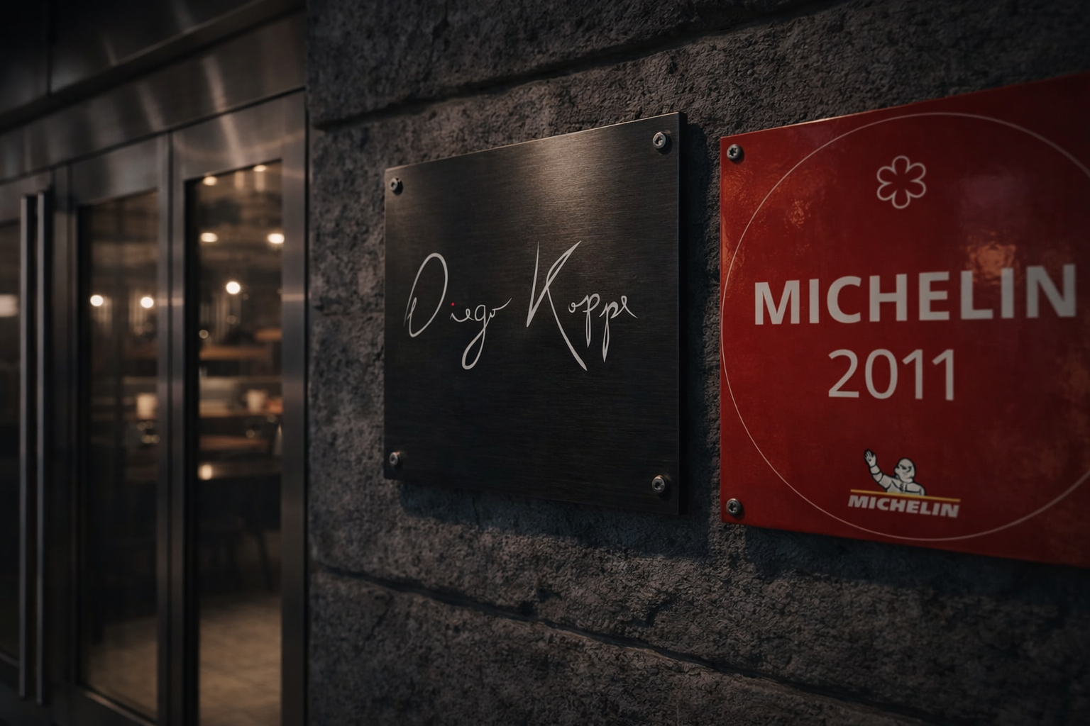
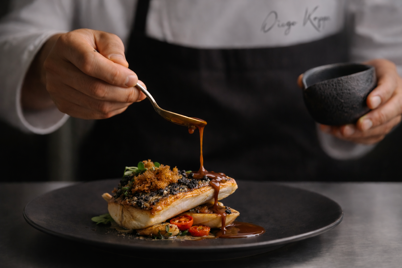
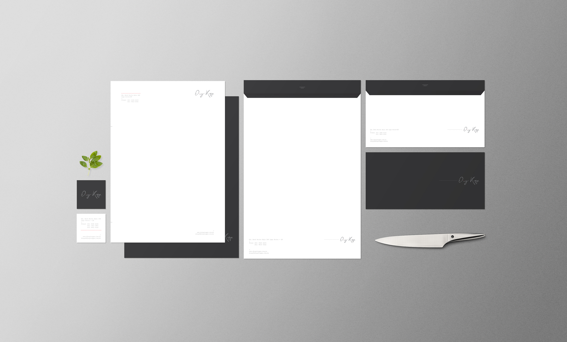
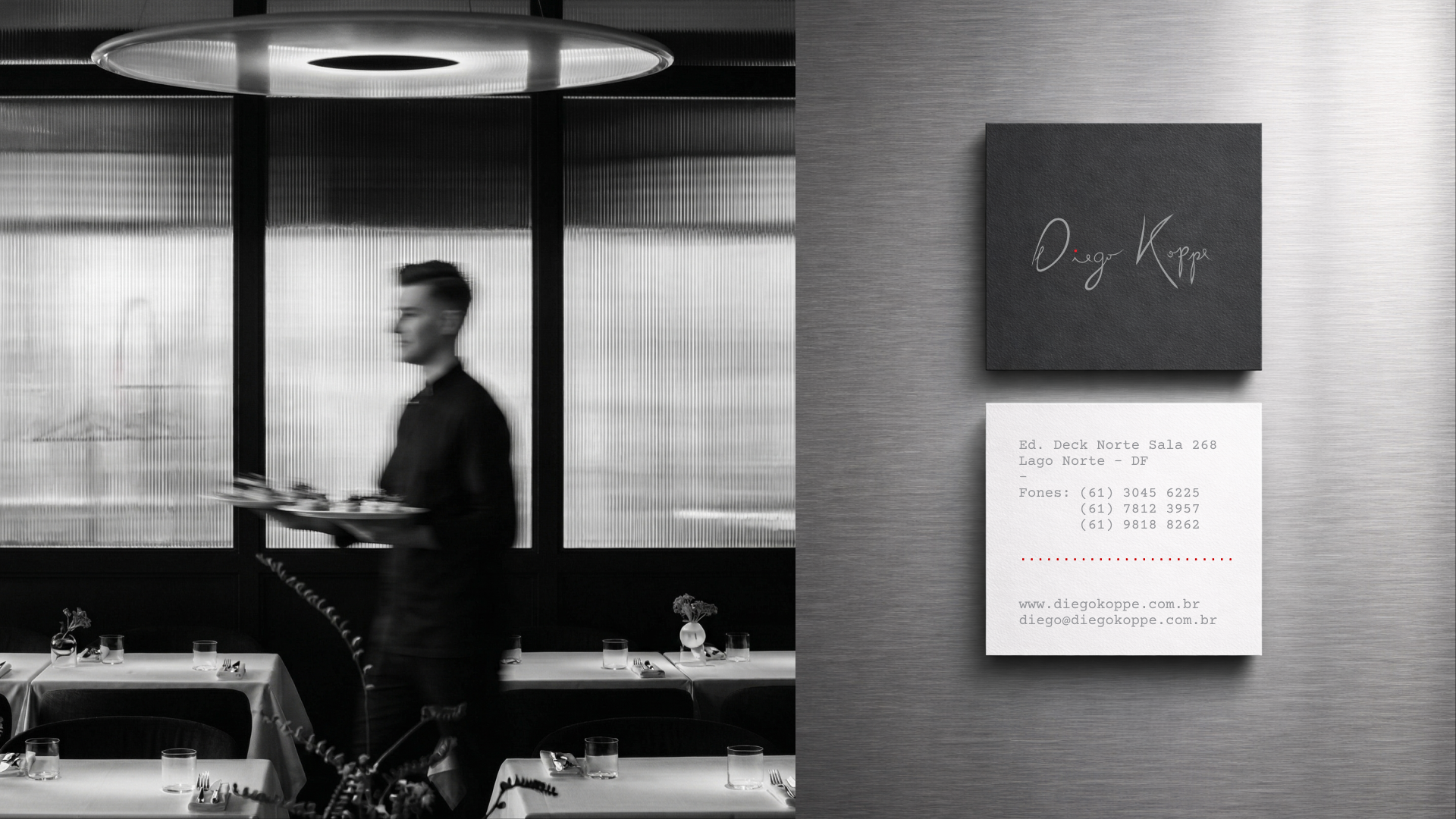
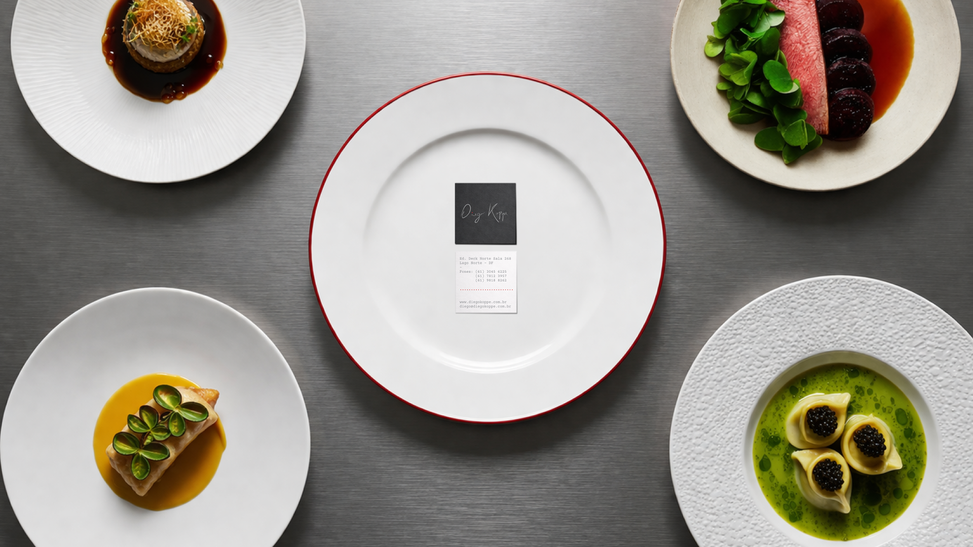
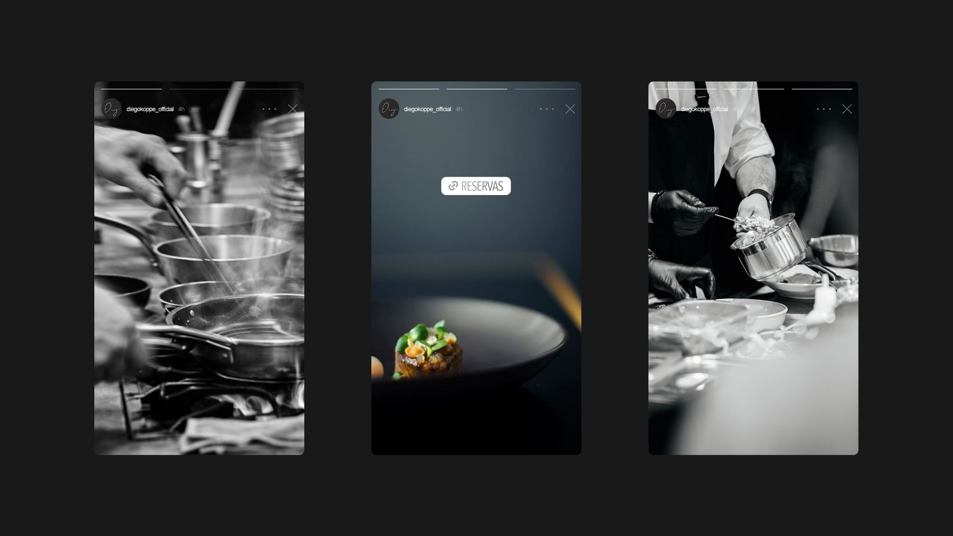
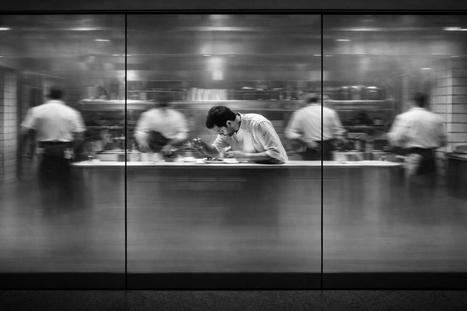
This visual identity was created for Michelin-starred chef Diego Koppe, a perfectionist who believes that true sophistication lies in simplicity.
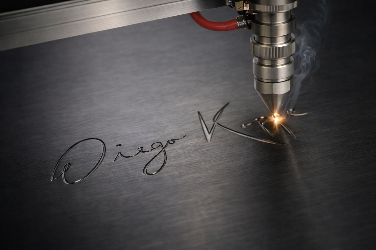
At the center is a single, elegant signature. One refined stroke that feels personal and precise. Just like his dishes, it appears effortless, yet every detail is intentional. The palette is reduced to essentials. Deep charcoal, soft white, and a subtle red accent that works like a final seasoning. Controlled. Exact. Never excessive.
Ample negative space allows the mark to breathe, much like a beautifully plated dish that speaks through balance and restraint. Minimal. Refined. Uncompromising. A signature as precise as Diego Koppe’s cuisine.
—
MY ROLE ↴
BRAND DESIGN / ART DIRECTION

PROJECTS
↴


©2026
SAY HELLO ☺
EDUARMACED@GMAIL.COM